
No:1 Tenis Kulübü
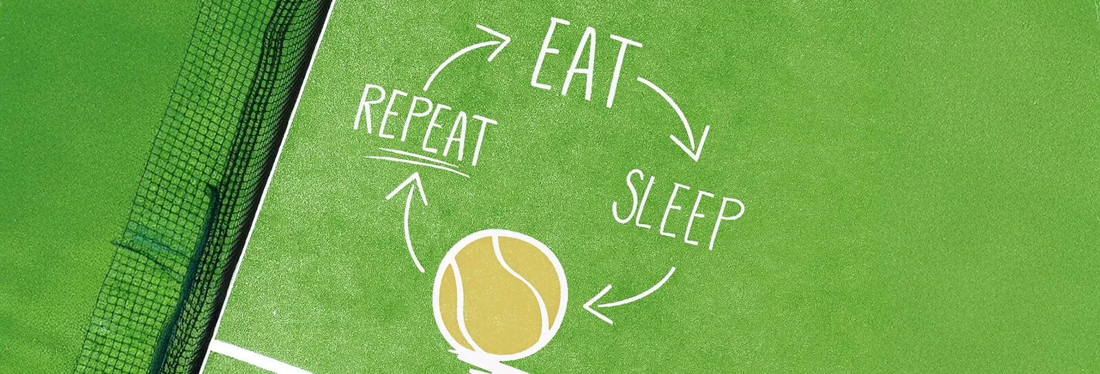
We gathered court energy into a single brand language
- Client
- No:1 Tenis Kulübü
- Services
- Graphic Design

Scope
- Logo Design
- Graphic Design (AI + static visual)
- Social Media Templates
- Mini Usage Guide (basic applications)
01The need
Inconsistency in social media designs was lowering brand perception. The logo and visual system wanted a more modern line. A template arrangement was required for announcements to be understood quickly. The goal was to succeed in showing the club as premium and energetic. Reusable formats were necessary for event contents. A clear CTA structure directing the follower to communication had to be established.
02What we did
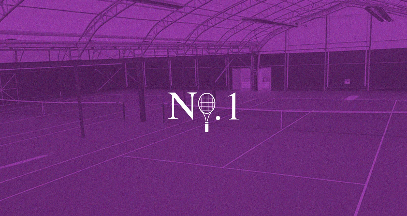
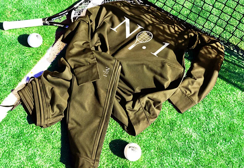
We standardized the visual language with AI and static templates. We clarified the club's modern identity with logo design. We simplified the hierarchy in announcement and event posts. We strengthened the premium sports perception with color-typography selection. We supported registration and communication conversion with CTA arrangement. As a result, the club became more consistent and strongly visible.
Credits
Client: No:1 Tenis Kulübü
Horus Mediaworks · Horus Team
- Project Manager
- Creative Director
- Logo Design
- Visual Design (AI/Static)
Planning something similar?
Next project →
Toprak Yalıtım
We turned technical trust into a simple digital experience